This week I have been assigned to do a concept for a level at the end of the last lecture I was asked to make it for the good kitchen and two other artists also did a level each. Upon leaving the class the next day I went on the forum to have a conversation about the level like we talked about but all that got done was a list of things for the level was generated. This didn’t help me at all. I think I just needed a proper to do list because I didn’t grasp what to do from a quick chat and a list. We have talked in previous meetings about the three main games that we are using for our inspiration towards the design and colour of the actual look of the game. So i'll be using these as my main inspiration.
Sly Cooper
The legend of Zelda the Wind Waker
And Super Mario Bros
So since the others were doing concepts for the level I would focus of the type of style and design of the level and the perspective. For the perspective I chose to go with Little Big Planet like we said we was going to do because it’s a nice angle and it suits for gameplay well for our game. This keeps it vague enough for me to work and useful enough to not be a waste of time for the other team members as I don’t want to create something that will not be of use.
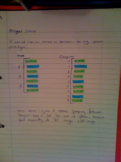
So after trying the forums I edited the set-up of the level so that there are less sub-layers, make the code so the NPC’s use the sub layers around the main layers the player is on as opposed to having two sub-layers per main layer.
Blue representing the main layer and Green representing the sublayers.
Blue representing the main layer and Green representing the sublayers.
Using this I then made a quick sketch of the potential final look of the camera design with the little big planet setup to make sure it all fit and looked good.
The green lines representing the perspective slowly increasing in angle as the camera moves further away. Three Logans were added, just to make sure that there would be enough room for him three times plus room for NPC’s to gather around him. As the image below shows there is plenty of room.
Next I made a sketch of how I though the (very) basic outline of the good kitchen level would look.
The poster won’t actually be in the game but it’s a placeholder to get an idea for stuff to put into the background.
Then I though add a little flavour to the level the kind that the team hopefully wants.
Thankfully I feel this gives everything a nice edgy look. So funny with this theme I intend to draw a toaster a single asset a few times for you guys to try and get an idea of how it looks and what kind of level of abstraction the team wants.
Then add a little flavour.
Next I tried adding a (Poorly drawn) sink to get a feel of how we would present it.
Then add some flavour.
Hopefully you team have thought about which ones they like, upon looking at the other concepts as well. From the feedback I will make a bigger design for the level next week that utilizes the chosen look.


No comments:
Post a Comment