Task 1 - Set a fortnight ago. - Interface
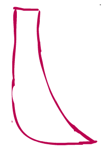
When I was issued this I got together with Sam and Hieu and we brain stormed about the Interface; we looked at the UI designs I had done on a previous week and thought about which ones best suited the project. So we chose one of our favourites and decided to start making prototypes of the design. Below is the designs we can up with the first one being the one we finally decided upon.

In addition to this I have collected research from various places on how we could go about implementing the health bar into the game the information is shown below:
This is a basic bar fill it in real time without having to swap images
(Downside is it’s a straight line)
3D platformer tutorial on the Unity Website Pages 50 – 55 are the pages that detail the Heath bar and give an example of how it works and how to implement it into your project.
It uses images combined with Alpha channels
The health bar is a series of 8 images. But there are 16 stages each bar has two states full and half opacity.
through the script Alpha channels are manipulated to give the illusion that heal that is being drained.
Though if we still go with the sword template then we will need to make something more fluid (Pardon the pun) as blood will go transparent but not in chunks.
Creating a circle cross bar
For Project Blend we do not want a circle cross bar we want one in the shape of a sword to fit in with the level.
So we will just adjust the alpha gradient texture to be the shape of our sword instead of circle.
This is perfect to implement into the project but it is complex and very time consuming so the 3D platformer may be used with the image propped more regularly instead of 8 segment maybe 10 – 12 for example so the alpha effect appears less blocky. This will add more data to process and may cause some unnecessary latency issues but it’s easier to implement.
Task 2 - Background Images for the game.
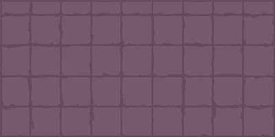
I deliberately haven't added the extra details into the images yet as I feel that they will come after the team and I have decided on a style and a size that appropriately fits the designs of the game. So below is a collection of concepts for the game to help decided what to start using for the games levels.
 | ||
| Figure 1 - Normal - Small |
 |
| Figure 2 - Normal - Medium |
 |
| Figure 3 - normal - Large |
 |
| Figure 4 - Slightly Distressed |
 |
| Figure 5 - Distressed |
 |
| Figure 6 - Distorted |
 |
| Figure 7 - Wavy Lines |
Things such as Vines, kitchen windows, cupboards, etc... Will be added as aforementioned after the team has come to a decision.


No comments:
Post a Comment