Thursday, 31 March 2011

Project Blend Playtesting Build 14 Michael and Alan – Movement and jumping

Movement Speed tests
We played through and decided to try and make Logan move faster so we changed the movement speed from 350 to 650.
650 was to so fast, it was possible to run past all types of enemies and not have to confront them.
So we decided to move it back down to 500. We noticed it was still too fast and some of the jumping puzzles were made unnecessarily tricky due to the speed of movement. Causing the player to either jump late or miss-judge some of the jumps.
Next we tried 400 it solved the jumping puzzles meaning that the player can still jump around with precision and move faster between objects in the level.

Fixing Tests
Ground Friction 1.15
At 3.00 it was far too slow
1.30 – The animations play smoother and it seems to be a nicer frame rate.
We then tried to see 1.25 but the animation went back to being a bit clunky and the animation went back to bobbing. So it has been decided that 1.30 is the best ground friction frame so far.
Current Setting: Move Speed = 400/ Ground Friction = 1.30


Jumping
Air Speed = 350.
Air Speed = 400 We changed it so that it was equal to the movement speed . and it worked pretty well but we wanted to see if we increased it a bit more that it would help with the jump.
So the Air Speed at 450 makes things a lot easier, jumping across the levels jumping puzzles, maybe to easy we want the jumps to be tricky but not so much that they annoy the player or get in the way to much.

Jumping Height
Jumping height = 450
475 improved
We wanted to make the jump as high as possible so stop the player having to repeatedly spamming the space bar to jump up an object.
We went to 500 but it proved to be too much so we changed it back to 475.
And we tried to jump up object that had an angle and because of the following two function
Slide angle 0.15
Slide force 120
We had problems as the spatula we were trying to jump up was in-between jumps sliding us back down meaning more jumps to reach the top of the object.
Life would be much easier if we took a banjo kazooie approach to this project either there’s slip and we can’t do up the object or there’s no slip atall.

We changed the air speed to 370 to compensate for the increased jump height to 475.
So that the player can’t cover too big a gap with each jump.

Gravity Strength -20
We changed it to -27
We tried it a little higher but the character didn’t jump very high off of the ground and at -30 the player sprite just seemed to shake up and down violently and quickly.

But after a few play testing sessions we changed a few things and then noticed that the player bounced off of most of the object populating the world. And couldn’t cover the gaps in the game and eventually we worked out that it was the gravity that was doing it as the player was returning to the ground faster than he could jump up an object so we changed it back to -20.

When gravity was set to -25, jump height had to be set to at least 495. However airspeed (which is 370) is now too weak to make jumps.
Airspeed barely works at 400 but it seems this won’t work any higher. Air resistance will have to be altered next.

Air Resistance
Originally 1.5 it was altered to 0.5, however this completely broke the game as the play flew through walls.

At 1.0 it works but there is not enough resistance. It works pretty well at 1.2.

Other issues
If gravity is too high, players smash into walls when using shifts and as a result bounce against the wall.

Conclusion
When gravity was increased to -25 it made jumping more believable and smooth, not the slow float as it looked like before. But to compensate for this increased gravity; the airspeed had to be increased drastically and air resistance had to be decreased by a small amount. As a result, the jumping feels a little too fast and free like being blown away by wind. This will need to be revived at a later date.

Thursday, 17 March 2011

Textures

In today meeting the team showed off a full level five but there was a lot of place holders and untextured assets, so the next job is to start finishing off the interface and add textures.

Interface designs

We talked through the research I had gathered and started to make plans for which idea to implement for the health bar. We decided on making a gradient map with images of a full health bar and an empty one. As shown below in figures 1 to 3.

Figure 1
Figure 2
Figure 3

Textures 

I was originally assigned three textures to draw and upload to the drop box but after I finished the first one, (Even though I told the rest of the team those were the ones I was doing) I found that the other two I was going to do were already done.
This has been happening for the last few weeks and it's also happening to other team members; tasks are being assigned and others are deciding to do them and no bother telling the person who was originally assigned them that they have been done.
Figure 4 - Knife and Bread Textures

Wednesday, 16 March 2011

Interface - Various Backgrounds

So I have further edited the background that was selected my Sam and myself. I've added a basic vine outline in figure 1 and various other kitchen bits and bobs in figures two through to five.

Figure 1

Figure 2

Figure 3

Figure 4
Figure 5
There will be more designs drawn up, but yet again it's time to show the team and see what they think.

Interface In-development

So I got to the guys house and started work talking about which design is best and we decided that we like figure 5 and 6 so I joined the two together, shown below. 

Figure 1 Distorted and Distressed

Tuesday, 15 March 2011

Interface and Background Textures

Due to commitments outside of University, I had gotten a little behind on my tasks. So I have taken the opportunity to catch back up on the tasks. so I can carry on with this weeks tasks. There has been an extra meeting set up for tomorrow that I will attend as I feel I need to do some extra tasks to catch up on what I have missed.

Task 1 - Set a fortnight ago. - Interface 


When I was issued this I got together with Sam and Hieu and we brain stormed about the Interface; we looked at the UI designs I had done on a previous week and thought about which ones  best suited the project. So we chose one of our favourites and decided to start making prototypes of the design. Below is the designs we can up with the first one being the one we finally decided upon.


In addition to this I have collected research from various places on how we could go about implementing the health bar into the game the information is shown below: 


This is a basic bar fill it in real time without having to swap images
(Downside is it’s a straight line)

3D platformer tutorial on the Unity Website Pages 50 – 55 are the pages that detail the Heath bar and give an example of how it works and how to implement it into your project.

It uses images combined with Alpha channels
The health bar is a series of 8 images. But there are 16 stages each bar has two states full  and half opacity.
through the script Alpha channels are manipulated to give the illusion that heal that is being drained.

Though if we still go with the sword template then we will need to make something more fluid (Pardon the pun) as blood will go transparent but not in chunks.


Creating a circle cross bar

For Project Blend we do not want a circle cross bar we want one in the shape of a sword to fit in with the level.
So we will just adjust the alpha gradient texture to be the shape of our sword instead of circle.

This is perfect to implement into the project but it is complex and very time consuming so the 3D platformer may be used with the image propped more regularly instead of 8 segment maybe 10 – 12 for example so the alpha effect appears less blocky. This will add more data to process and may cause some unnecessary latency issues but it’s easier to implement.


Task 2 - Background Images for the game.
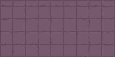
I deliberately haven't added the extra details into the images yet as I feel that they will come after the team and I have decided on a style and a size that appropriately fits the designs of the game. So below is a collection of concepts for the game to help decided what to start using for the games levels. 

Figure 1 - Normal - Small

Figure 2 - Normal - Medium
Figure 3 - normal - Large
Figure 4 - Slightly Distressed
Figure 5 - Distressed
Figure 6 - Distorted
Figure 7 - Wavy Lines

Things such as Vines, kitchen windows, cupboards, etc... Will be added as aforementioned after the team has come to a decision.